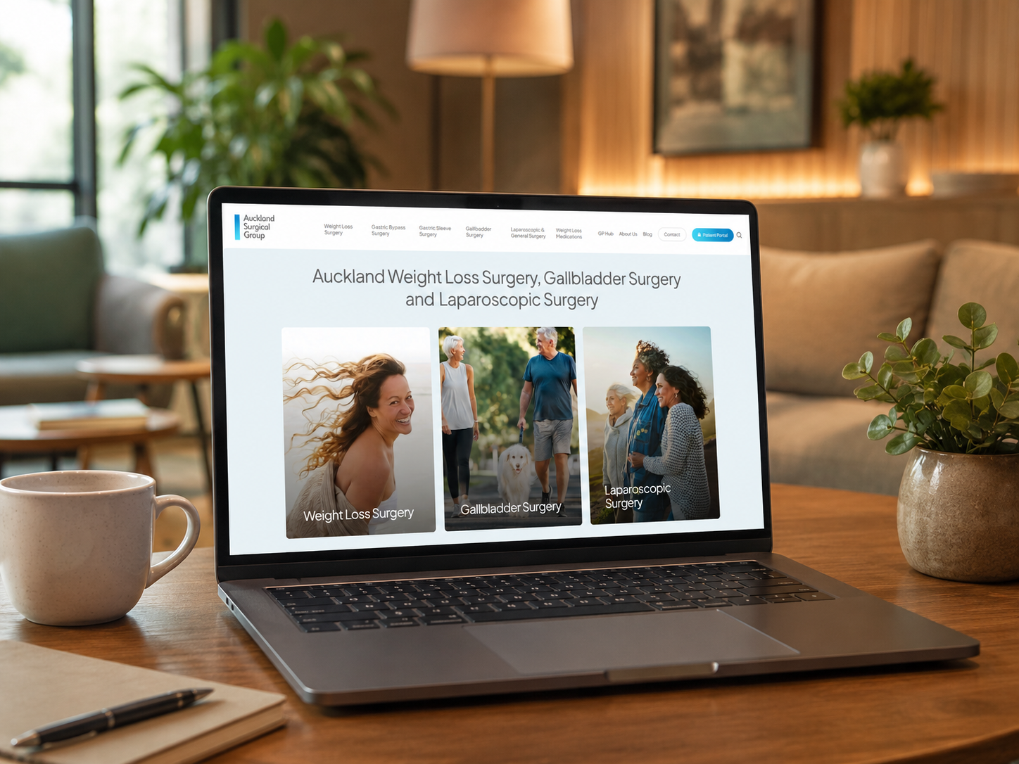
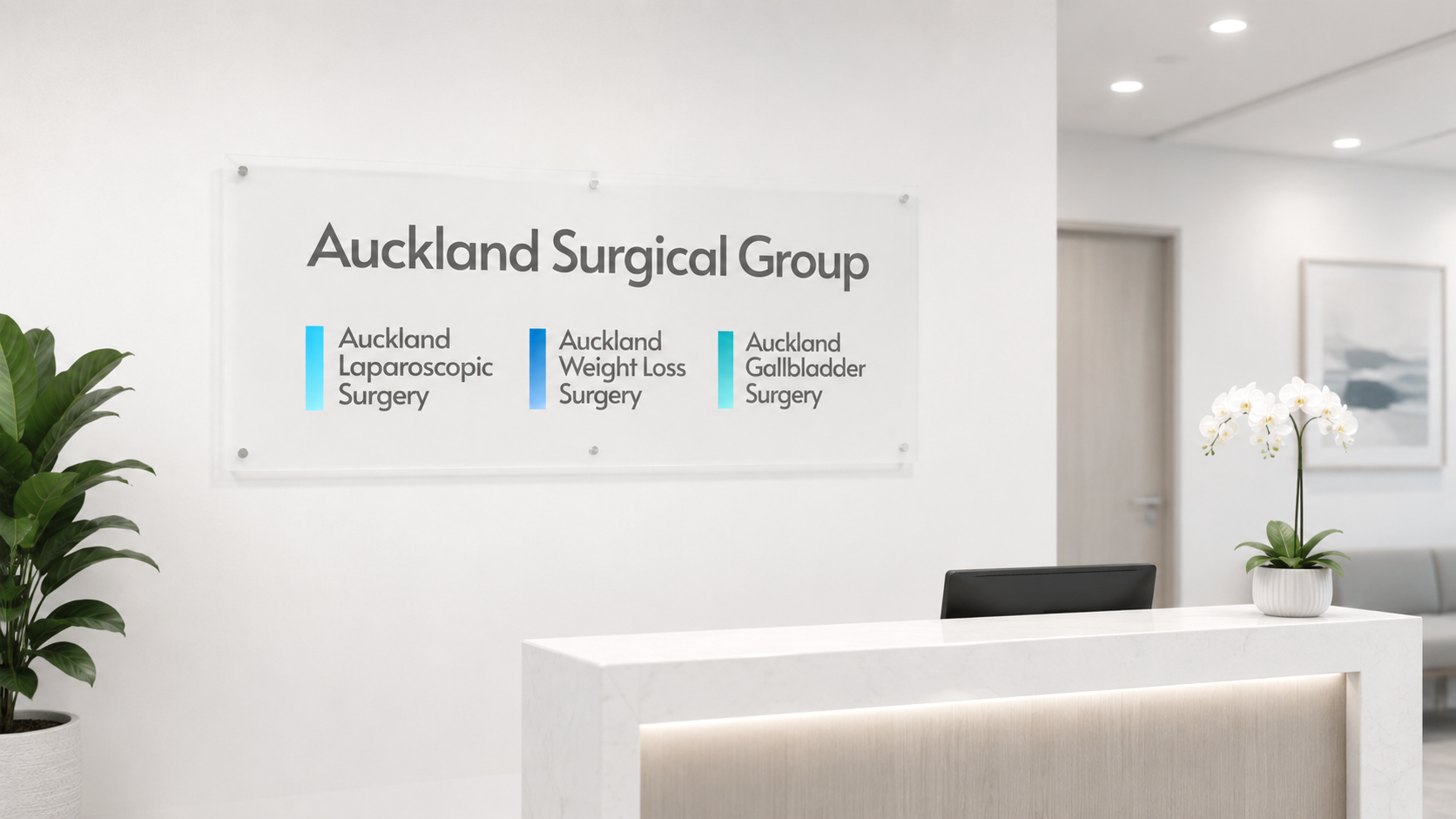
Brand IQ helped transform Auckland Weight Loss Surgery into a broader umbrella brand, Auckland Surgical Group, bringing together three specialist areas under one cohesive identity: Auckland Weight Loss Surgery, Auckland Laparoscopic Surgery, and Auckland Gallbladder Surgery. The project involved brand strategy, website restructuring, empathetic medical copywriting, SEO-conscious migration planning, and a visual refresh designed to feel informative, reassuring, and human.
For many years, Auckland Weight Loss Surgery had built strong recognition in its field.
The problem was that the name had become too narrow.
While weight loss surgery remained a major part of the practice, the four surgeons also specialised in laparoscopic and gallbladder surgery. Patients were already coming to them for a much broader range of procedures, but the brand structure didn’t reflect that reality.
Everything still sat beneath a name that implied they were all about weight loss.
That created confusion, limitations for future growth, and an online presence that no longer matched the true scope of the business.
The solution wasn’t simply a new website. It required a complete rethink of how the practice presented itself to patients.
We developed a new umbrella identity, Auckland Surgical Group, designed to bring together the practice’s specialist services under one cohesive, credible master brand. Beneath it sat three clearly defined specialist areas: Auckland Weight Loss Surgery, Auckland Laparoscopic Surgery, and Auckland Gallbladder Surgery.
Structurally, it immediately made more sense.
Patients could now understand the broader expertise of the surgeons while still easily navigating to the specialist information most relevant to them.
But behind the scenes, there was another challenge.
Over time, the old website had accumulated a large number of pages, many of which overlapped, repeated information, or no longer served a meaningful purpose. Like many long-running medical websites, it had gradually become more complex than it needed to be.
Part of the project involved carefully auditing the entire site structure and simplifying the experience for users.
Some pages were removed altogether. Others were blended together into stronger, more comprehensive pages that reduced duplication and improved navigation clarity. The goal wasn’t just to make the website look better. It was to make it easier for anxious patients to find answers without getting lost in unnecessary content.
At the same time, we had to ensure the restructuring process didn’t damage the strong Google rankings the business had built over many years.
We worked closely with the client’s SEO agency to carefully manage URL redirects and preserve existing search authority during the transition. That collaboration was critical because changing site architecture without a proper redirect strategy can significantly impact rankings, particularly in highly competitive healthcare categories.
The final structure became cleaner, more intuitive, and far more strategically organised while still protecting the SEO equity the business had already earned.
The copywriting itself became one of the most important parts of the project.
Medical websites walk a very fine line emotionally. Patients researching surgery are often anxious, overwhelmed, vulnerable, or uncertain. They are not browsing casually. In many cases, they are researching life-changing decisions.
That meant the tone of the website needed to feel highly informative without becoming cold or clinical.
It needed empathy without sounding overly emotional.
And it needed reassurance without slipping into vague marketing language.
Every section was carefully written to feel calm, clear, and human. Rather than overwhelming visitors with medical terminology or long blocks of technical explanation, the information was structured to answer real patient concerns in a more approachable and supportive way.
We wanted visitors to feel guided, not lectured.
Instead, the imagery focused on lifestyle, wellbeing, recovery, confidence, movement, family, and everyday life after treatment. The visuals intentionally reflected a broad range of ethnicities, cultures, and age groups, helping the website feel more representative of Auckland itself and the diverse range of patients the practice cares for.
That inclusiveness mattered.
People want to see themselves reflected in healthcare brands. They want to feel understood before they ever make contact.
The final result feels significantly more modern, more cohesive, and far more aligned with the actual experience of the practice.
Importantly, it also created a scalable structure for the future. Instead of trying to force multiple surgical specialties beneath a single narrowly defined brand, Auckland Surgical Group now provides a clear umbrella platform that can grow alongside the business.
Projects like this highlight how much healthcare branding has changed.
Patients no longer judge medical providers solely on qualifications and credentials. They also judge clarity, empathy, trust, communication, and overall experience, often long before they ever pick up the phone.
A website has become part of patient care.
In the case of Auckland Surgical Group, the goal wasn’t to create something flashy or disruptive. It was to create something human. Something calm, credible, and reassuring that reflected both the professionalism of the surgeons and the life-changing outcomes patients hope for.
The final website feels less like a traditional medical site and more like a supportive guide through an important personal decision. And with the brand refresh also came the need for new clinic signage, business cards, and other collateral, all taken care of by Brand IQ’s design team.